Artists

Walking for color (and some Beeches for real this time)

I am thinking about my palette for paintings and I have been doing a lot of walking lately.

Now, I am not the sort of person who has ever been remotely interested in painting the landscape.  Seriously, it was something I did when I was in school but I was never very good at it.  Then I went to Skowhegan and I met amazing painters who were really committed to painting the landscape (like Ellen Altfest, Frank Meuschke,  Lois Dodd, and Yvonne Jacquette) and I knew I didn't have that kind of commitment in me for the landscape.

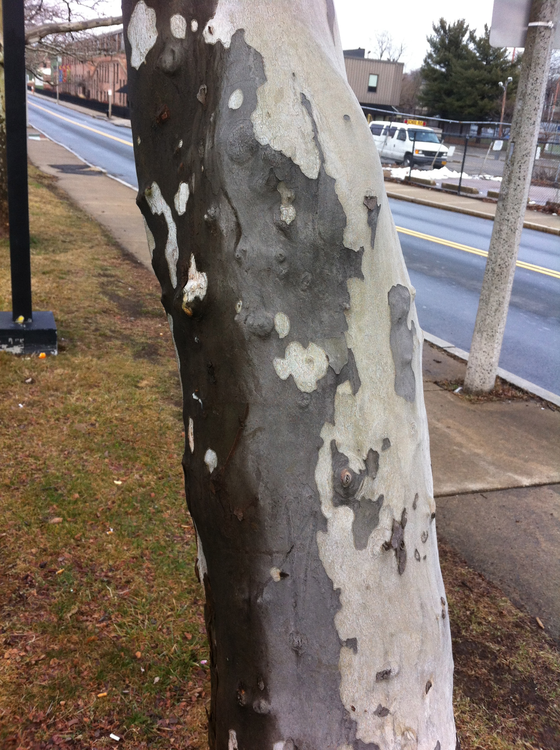
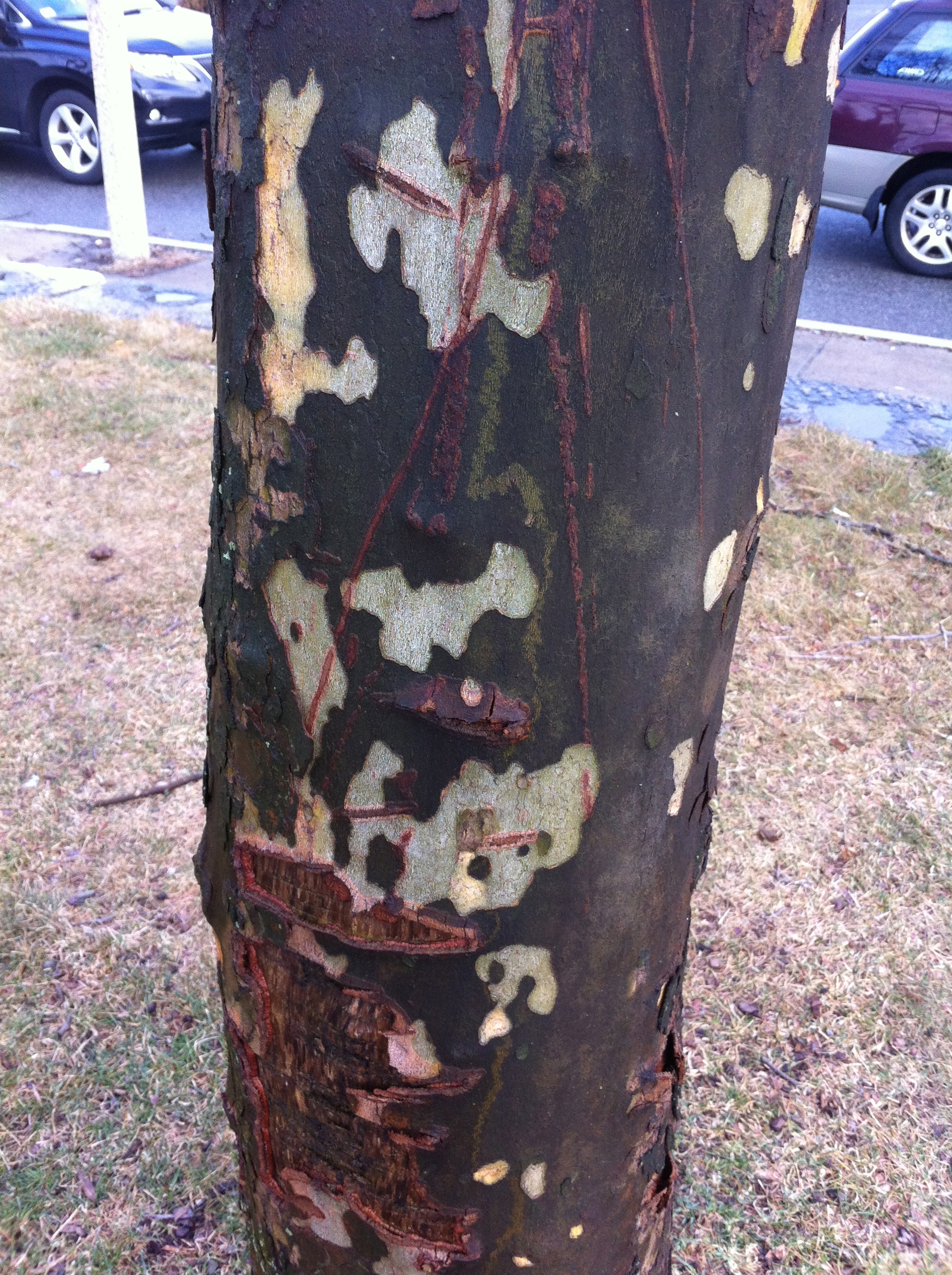
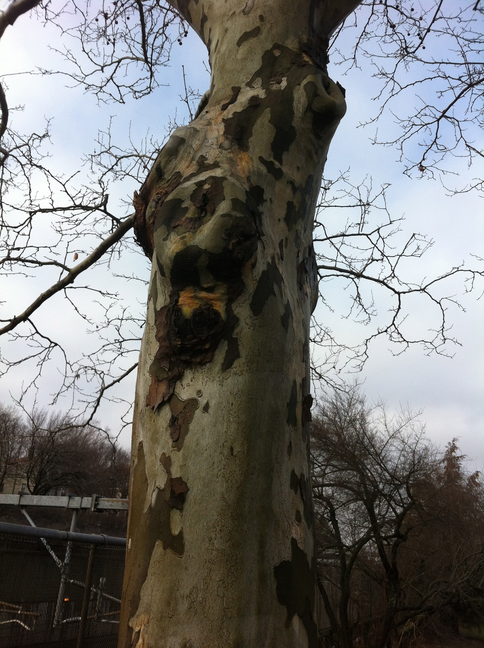
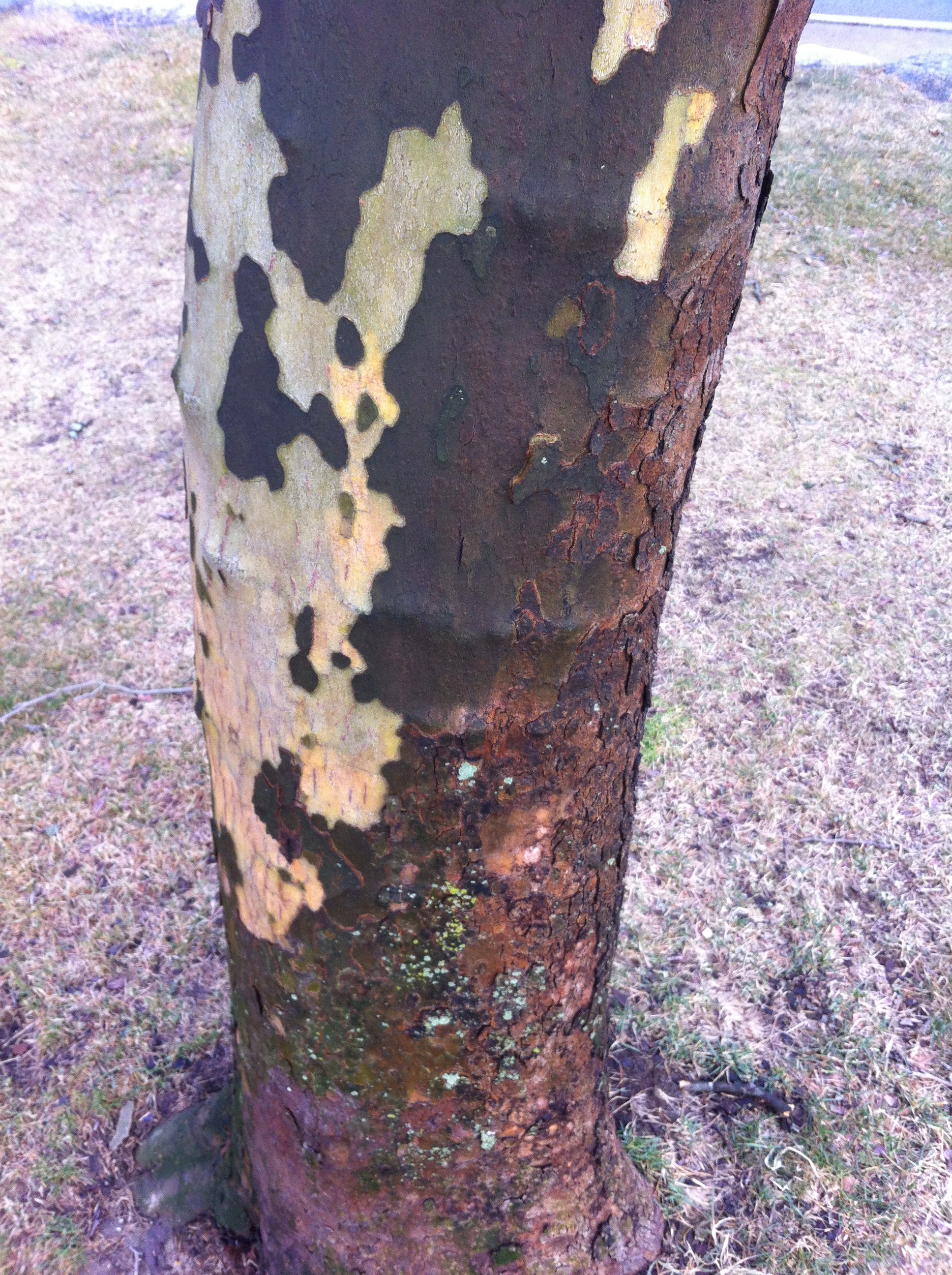
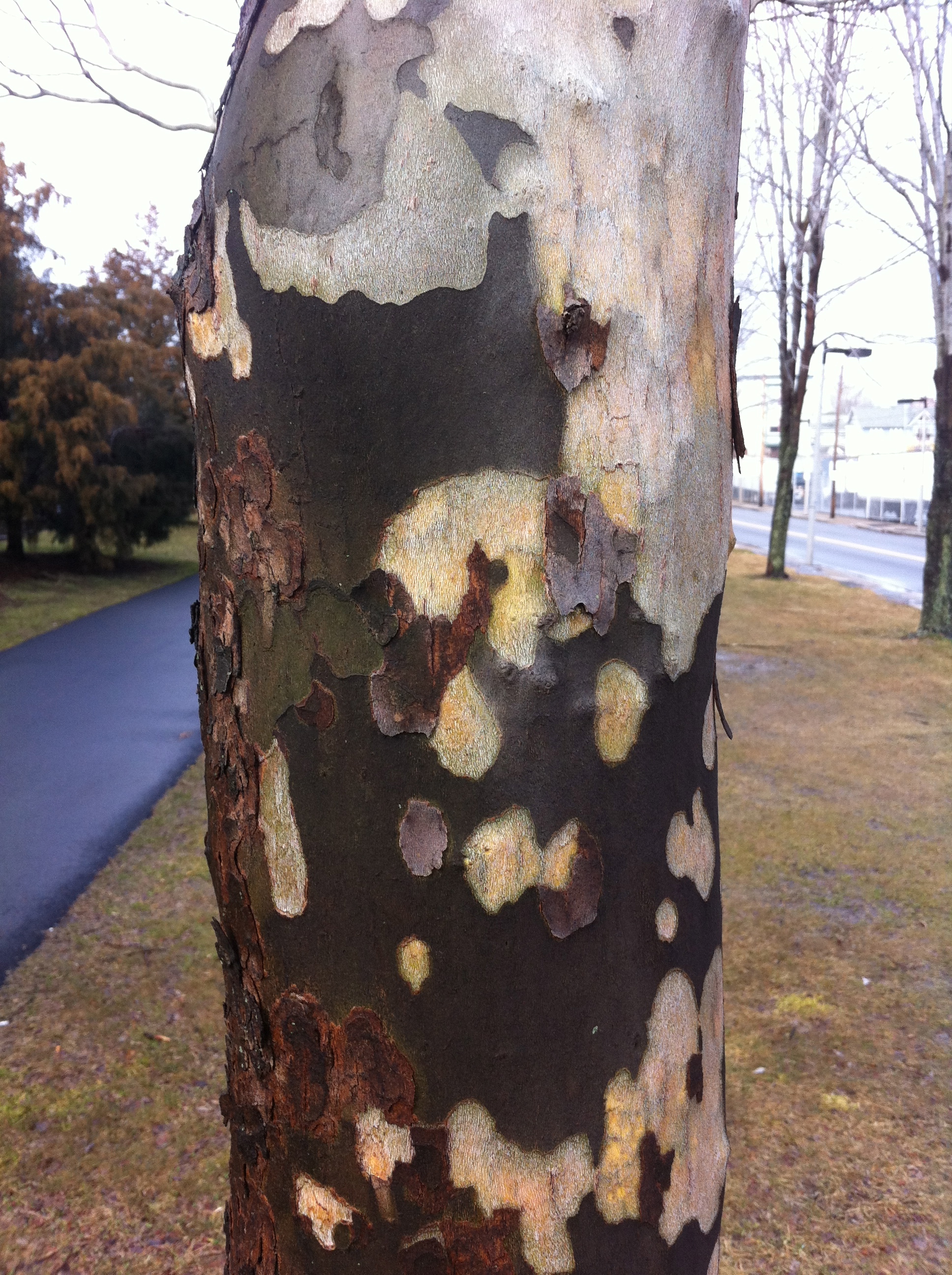
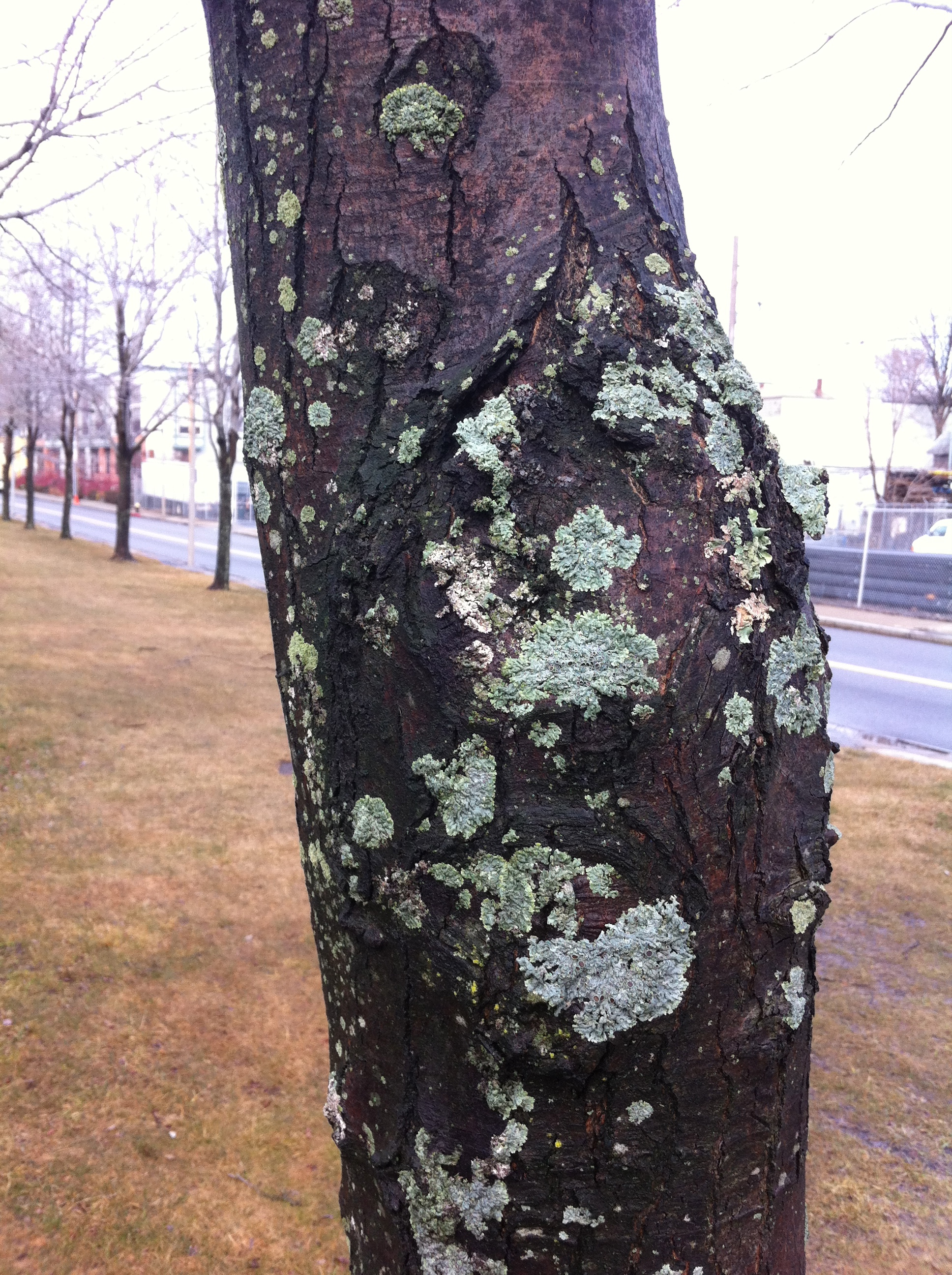
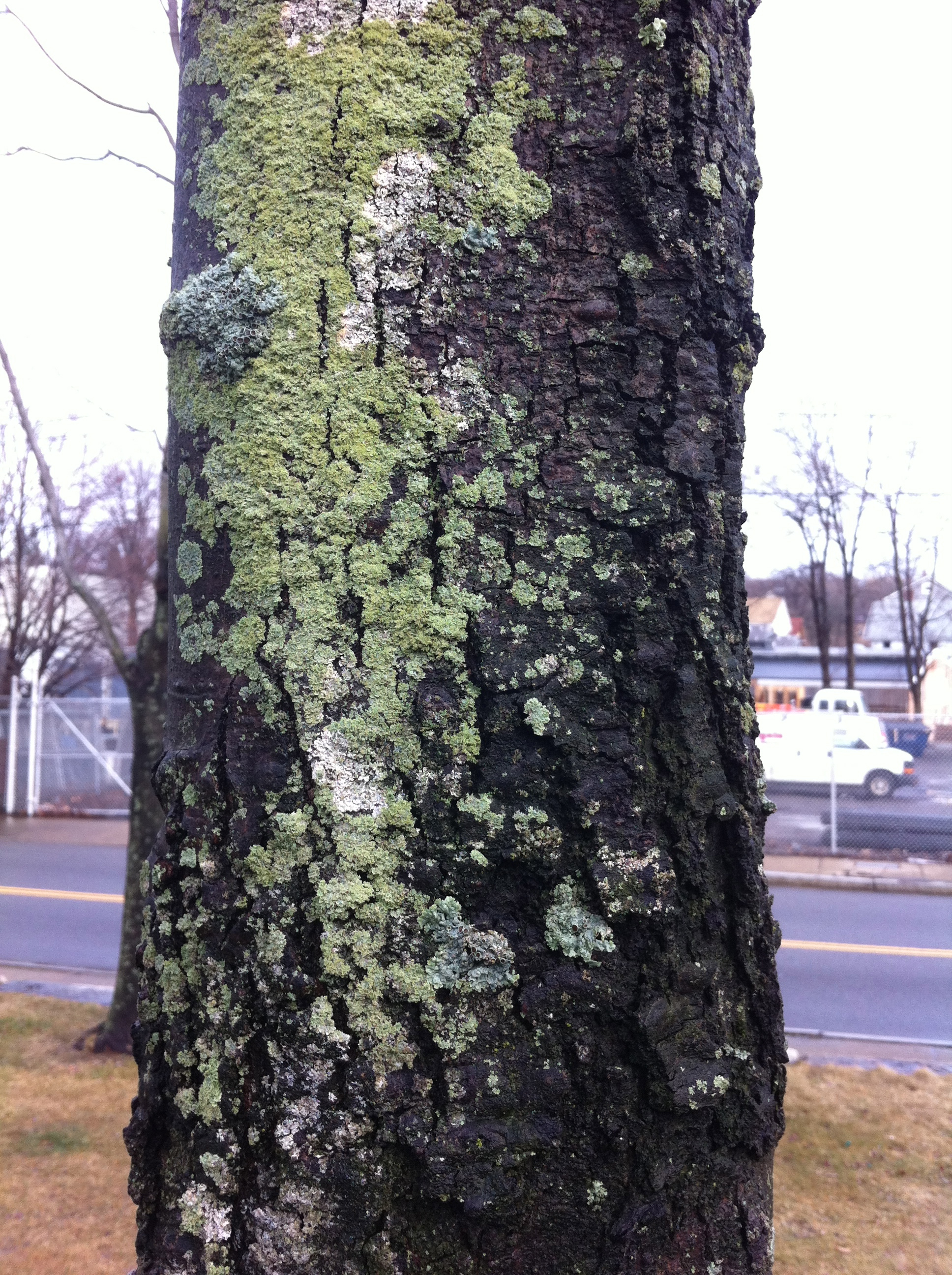
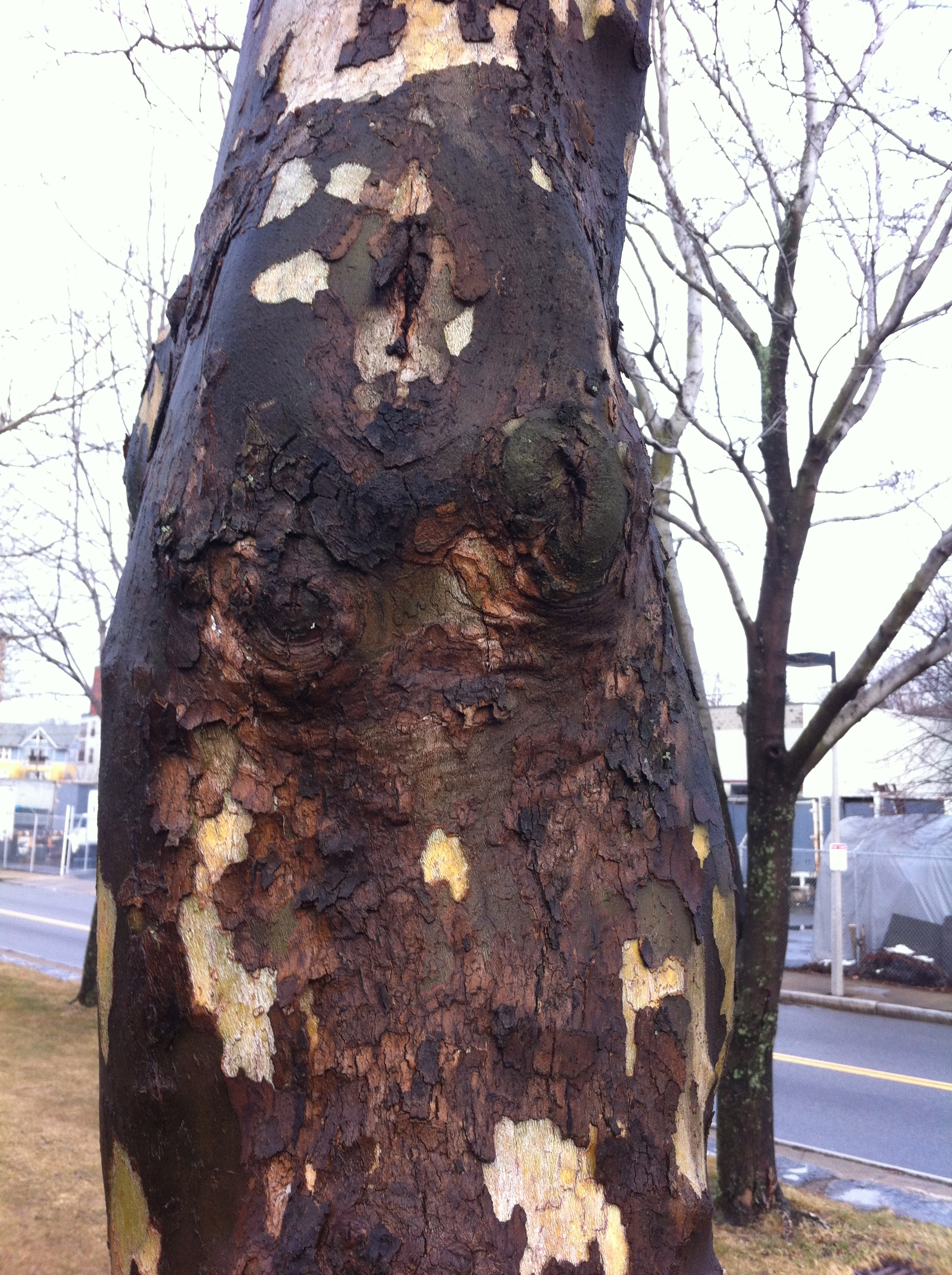
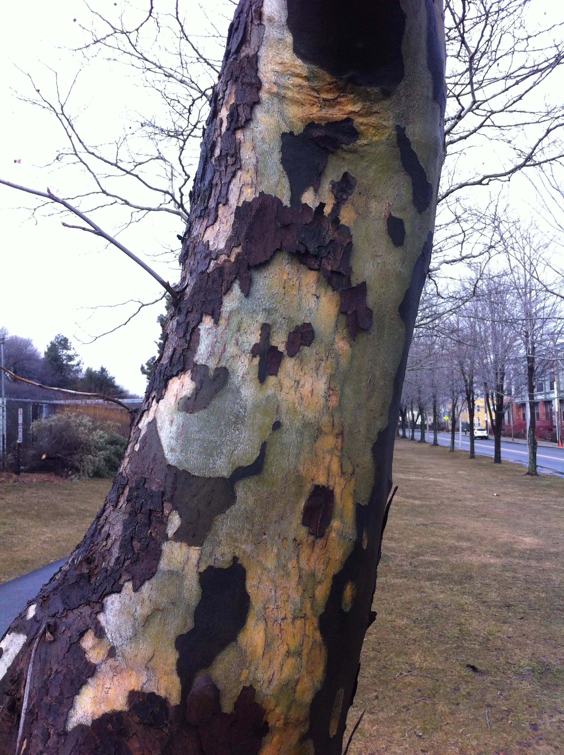
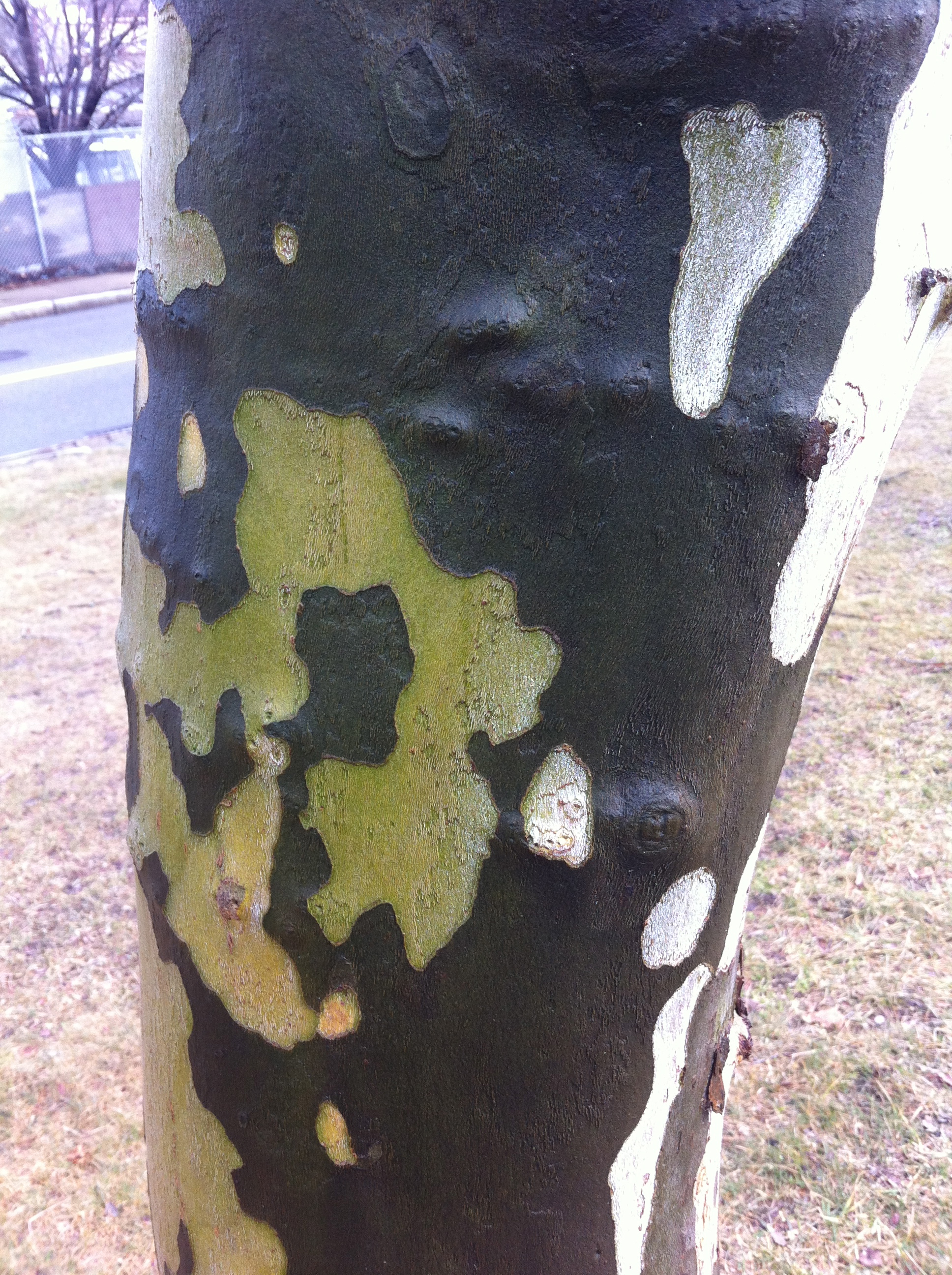
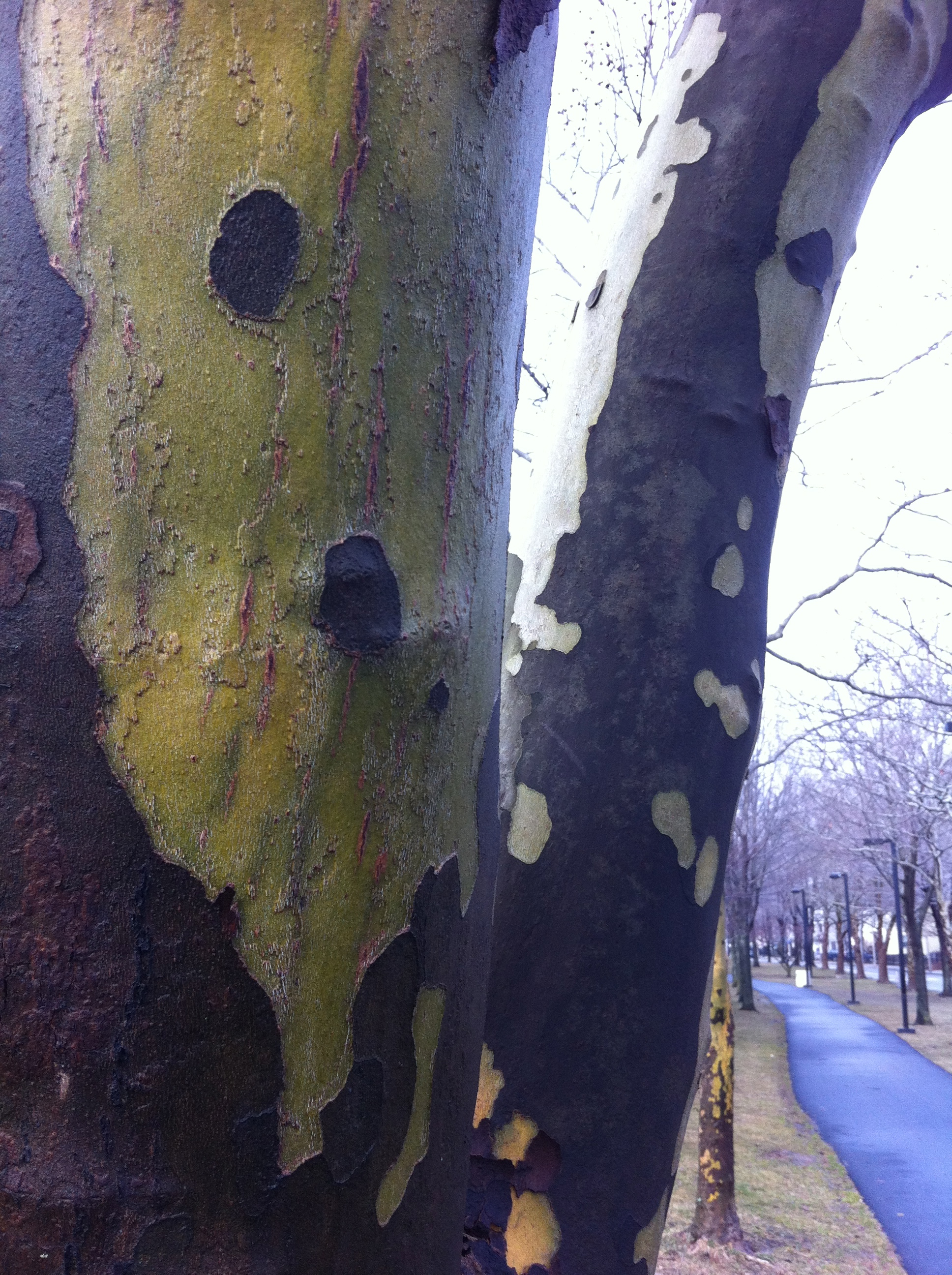
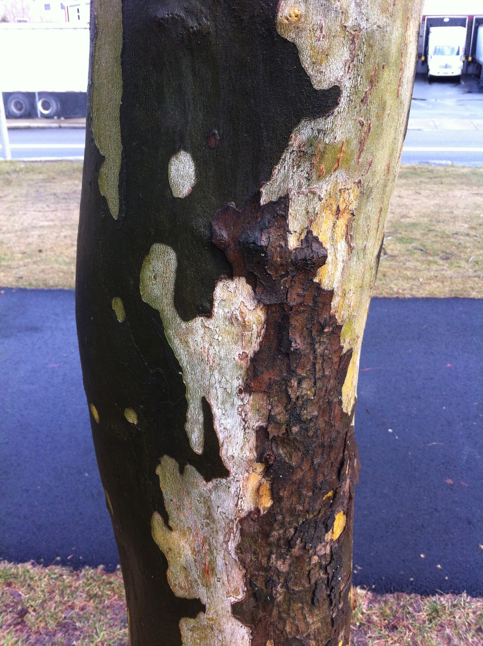
I will say that the color in the landscape has become very urgent for me lately.  Specifically, the way green is becoming a situation for color.  I start thinking what it could mean to formulate a painting where varieties of green are the basis for the color relations. So I've been walking in the landscape a lot lately and looking at trees. And mixing that color when I get home.

Who is better than Stephen Tourlentes?

Well, the short answer is nobody, and if you don't believe me you really need to go see his show OF LENGTH AND MEASURES at Carroll and Sons. These pictures marry the poetics of the sublime with the hard reality of the administration of death. He makes clear the beauty of these landscapes comes at the expense of (and in fact is due to) the luminous presence of the prison complexes that house and administer death in the name of the people. That he is a brilliant technician is well on display in this exhibition but the thing that stays with me is that Tourlentes has used his considerable talents and technical acumen to focus on a part of contemporary life we care not to consider nor do we want to know how we benefit. (Many prisoners are stripped of their voting rights. Some of these complexes house thousands of prisoners, increasing the state's population and thus their political representation. Michelle Alexander probes this in THE NEW JIM CROW.) Pictured is an image of Ardmore, Alabama, Alabama Death House, 2004. Trust me, this cheesy jpg is nothing compared to Tourlentes's actual photos. He was my favorite to win the Foster Prize last time around. This exhibition shows why he is one of the best artists working right now. I'm glad he is really starting to get his due. Image

BAGLY Prom photos Gallery Kayafas

Social documentarian Zoe Perry-Wood has a gorgeous show at Kayafas - pictures of BAGLY kids going to their prom.  These sweet and participatory portraits and images of kids getting together to celebrate made my heart sing. It was also really great to see photos of LGBT kids just being kids and Perry-Wood photographs them acting like the beautiful kids they are.  Here are photos of teenaged queer couples and dancers and lovers made without exploitation or salacious probing.  They whole show feels like a gift from Perry-Wood to the kids and a gift from the kids to us.  How different my life may have been if I had walked into this gallery as a teenager. Image

Beckmann makes other painters look like scrubs

20120407-054736.jpg A detail from the glorious "Self-portrait in a Tuxedo" (1927) on view at the Harvard Museums weird ass "greatest hits" installation at the Sackler. Everyone is usually kvelling over his use of black but the joy is the chromatic shadows in the face. You can see this painting and then go look at the Poussin's upstairs and wonder how people could ever think that making a shadow was a matter of adding black.

Lessons from a Music Lesson

I was walking through the Museum of Fine Arts, Boston the other day.  I was having a particularly nasty studio day.  Nothing was going well and every color I tried to mix ended up as mud.  I figured I should go look at the work of people who knew what they were doing before I did anything else.

I ran into Elliot Bostwick Davis in the gift shop and we chatted briefly about the coming hurricane.  Elliot is the John Moors Cabot Chair of the Art of the Americas and as such she is responsible for the new Art of the Americas Wing at the MFA.  Personally, I love her for getting all of those Gilbert Stuart paintings back on the walls.  I hadn't seen her since she did a panel discussion with Fred Wilson at Northeastern University so it was good to see her and catch up a little.  We were both super worried about the effects of the storm on our neighborhoods (she's in Dedham, I'm in Hyde Park).

I didn't have a destination on this trip.  Sometimes I go to the museum to look at something specific, but when I have a bad studio day, I prefer wandering. I find that my blocks in the studio mean that I need to see something in a new way.  When this happens I know that I am looking for something and I am certain that I will recognize it when I see it.  It may not even be something in the museum, but I know that I have to get out of my studio and look at some stuff - stuff that has nothing to do with me.

There's a Manet in the MFA collection called The Music Lesson.  I hadn't seen it in a long time and it was up in the French room on the second floor. It's a double portrait of Zacharie Astruc and a woman holding sheet music.  I'm certain this woman has a name and for a long time I thought it was Madame Manet but I have since learned that it isn't her.  Because I hadn't seen it in a while, it was fresh to me.

It was like seeing someone you think is really attractive and then you realize it is someone you know and were in love with at some point.

What struck me this time in seeing it was how dark the painting is.  It's very dark, but it doesn't feel flat.  That was at odds with how I was experiencing the color.  The restricted palette (save for the edge of the oriental carpet) still indicated a tremendous sense of weight and volume in the dress and in the full face of the woman.  It was not a Cezanne solution where color next to color built up the weight of the image and it wasn't a picture that relied solely on drafting to create that illusion of weight (like Matisse).  I looked at it for a long time and I was sort of stupefied as to how a picture so devoid of color interval and concessions to raking light could have such a dramatic physicality.

Anne Coffin Hanson has an essay called "Manet's Pictorial Language" that I never really understood until now.  In it she talks about Manet as a painter who is thinking deeply about how we see and the way the facture of the painting contributes to the understanding of the image.  She talks of Manet's brush "caressing" the contours of the figures.  I can see it in this picture so clearly.  Manet changes directions, applications, touch, and weight in this picture so often that a close investigation reveals the way that he is using mark and directionality to not only guide the eye, but to describe form.  This I think is what allows him to create this mass of volume and in the fabric and the feeling of movement in the portraits.  He is using the brush not just to depict the things in the painting, but he is moving the material of the paint into eddys and pockets that maintain their force as physical marks that convey a sense of volume. And it seems to me that he did it at the expense of a broad palette to focus the viewer's eye on the intervals of marks rather than those of color.

There is very little difference in color in the faces.  Even the rosiness of the cheeks of the woman seem to be glazed rather than directly painted (which probably explains why they feel more like make-up).  It is Manet's invention in the making of the marks that is creating the exceptional ease of the portraits and the immediacy of the painting.

Until now, I never really thought of Manet as someone who was developing a new language through mark making.  I think I was so overcome by his compositions and directness, I never gave much thought to how he got to the wonderful economy of his pictures.  I think a lot of painting focuses on obvious mark making as evidence of emotion or labor.  In the Music Lesson, Manet equates touch and volume by invention of a system of marks that reveals itself on close inspection. It makes me want to reinvestigate the color sensations of other double portraits like In the Conservatory, or  Boating  to see how much of what I am reading as space is due to color and how much is related to directionality and mark making.  The subtlety of Manet's inventions and the broad effect of them are clearer to me now.

And so back to work.

Talking about not talking....

Well, it has been a very interesting couple of days.

My friend Tom runs a blog called The Good Men Project.  He was putting together a edition of the blog on race.  And he asked me to contribute.

I should say that Tom and I have been friends for well over a decade.  I've held his children, he's seen me cry, we've have very similar experiences with mental illness in our families and have had to come to terms with a lot of our dreams and limitations as men.  He's a great guy and I love him a great deal.  So when he asked to me to write about race I knew that he was asking me, his friend, to write.  He wasn't asking his "black" friend to write.  He knows me, knows the range of my interests and thoughts and values that.

Tom may certainly look white, but he's never acted white.  I will leave it to my hero, James Baldwin, to explain what I mean.

As a policy, I don't usually talk about race.  It's too difficult.  But as I said, Tom is my friend and because he asked me to, I figured I would tell him, in an unvarnished way, why I don't want to talk about race.

There's been a pretty wild response to my letter to Tom.  I am really grateful to him for the opportunity to say things that I have been thinking for a long time.  My friend Patrick sent me a link on tumblr that had "reblogged" a section of it over 300 times.  I am sort of amazed that so many people are reading it.  As of now, there about 700 reposts on Facebook.  I know that isn't "viral" but people are sharing what I wrote.  I didn't upload a cat video, I wrote a polemic and people are interested in it.  That is really wild to me.  The comments have been pretty interesting.  Some people really don't get what I am saying and some people really need to not sit at the computer all day writing responses to blog posts.  I have seen the same guy on a bunch of blogs.  He really makes me glad that my home address isn't published with the article.

One of the reasons I started this blog, or rather why I came back to this blog, was to really start to try to write.  I wanted to dismantle the notion that an artist is purely a visual person, that somehow I lost my voice because I make images.  A lot of the artists I admire were terrific writers about art and culture.  Fairfield Porter was the art critic for The Nation, at a time when the flavor of art had very little connection to his practice as a painter of the observed world.   I always loved that he loved art so much that he could write about it as well as make it.  I aspire to that.

Thank you, Headmaster....

"Headmaster is an assignment-based queer print publication based out of Providence, Rhode Island. Smart and sexually provocative, Headmaster appeals to a discerning audience of man-lovers."  That's what it says on their website and it is very true. I got a very sweet email (after a particularly shitty day teaching) from Jason Tranchida, one of the editors of Headmaster.  He told me about the magazine (I loved name) and sent me a copy.  I loved it and was thrilled that he and the editors were considering me for an assignment.

The email containing my assignment was very enigmatic:

"Choose three or more characters from various works of literature.

Create a series* of paintings placing these characters in a single contemporary context.

The paintings, as a series, must expose the characters’ relationships to each other.

* 5–7 paintings."

I was a bit stupefied.  I could not for a second imagine how to do something like this but Jason (like any good headmaster) clarified things for me.  I got another email from him and after reading it I started thinking about Fassbinder's Querelle. I watched the movie years ago but I felt the urge to see it again.  I was really in love with Brad Davis.

I created a suite of paintings called for genet that you can see in Headmaster No. 2.  This issue also features the work of Stéphane BarbierJesse Burke (who also took the stunning cover photograph), Heyd FontenotKrys FoxSteven FrostM KitchellJohnny MurdocJoseph Segal, and Thomas Weidenhaupt.  The work, layout, and presentation are sexy, elegant, and captivating.  It's great company to be in.